In this blog article I will share some information about the proclaimed relationship between Sound and Color from various sources throughout history. This blog article is not a scientific thesis or theory, but more like a compilation of various ideas, thoughts and theories (some scientific, others philosophical) throughout history.
Even though both light and sound can be visually “represented” by waves and the unit Hertz can be used for both, there are nonetheless at least as many differences as there are similarities. It is therefor very important to mention that sound and light are not the same “thing” and the effect they have when “interacting” with the world around us (as well as the effect they have on use beings) differs thus as well. More about this later. Because of this difference you can not simply “replace” one with the other. This said, for some people sound and light/color though can be “complimentary” and/or “enhance” the experience of both sound and light.
Note: The text quoted and shared images used belong to the authors I quote. I have provided links to their web sites, where you can find a lot more interesting information about this and other subjects.
EARLY RESEARCH
In the 13th century, Roger Bacon theorized that rainbows were produced by a similar process to the passage of light through glass or crystal.
In the 17th century, Isaac Newton discovered that prisms could disassemble and reassemble white light, and described the phenomenon in his book Opticks (1704).
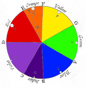
Newton divided the spectrum into seven named colors: red, orange, yellow, green, blue, indigo, and violet. He chose seven colors out of a belief, derived from the ancient Greek sophists, of there being a connection between the colors, the musical notes, the known objects in the solar system, and the days of the week.Newton’s color circle (from Opticks) shows the colors correlated with musical notes. The spectral colors from red to violet are divided by the notes of the musical scale, starting at D. The circle completes a full octave, from D to D. Newton’s circle places red, at one end of the spectrum, next to violet, at the other. This reflects the fact that non-spectral purple colors are observed when red and violet light are mixed.
In the 18th century, Goethe wrote about optical spectra in his Theory of Colours. Goethe used the word spectrum (Spektrum) to designate a ghostly optical afterimage, as did Schopenhauer in On Vision and Colors. Goethe did create his own color-wheel, but did not specify a particular color-tone combination as Newton did (see above).
SENSATION OF SOUND AND COLOUR AND THEIR “DIMENSIONS”
“If our ears contained just a few individual sensing elements, each tuned to one particular absolute frequency, we might all be able to recognize the absolute “color” of audible tones just as well as we can recognize absolute red. However, the ear needs to respond over a much larger range of frequencies, and the dimensionality of the “space” of audible sensation is much greater, we can distinguish a much greater variety of spectral characteristics of sound than we can of light.
Roughly speaking, the coiled cochlea of the human ear has a varying elasticity along its length, so it can be regarded as a series of oscillators of different resonant frequencies, and these perform a fairly detailed spectral analysis of incoming sound waves, transmitting to the brain something a 3000 point spectral profile. The detailed mechanics of how the cochlea responds to stimuli are very complicated, and the study of this function is hampered by the fact that the mechanical properties change significantly if a cochlea is removed for study. Nevertheless, it seems clear that whereas the spectral analysis of optical stimuli has only three dimensions, the spectral analysis of aural stimuli has at least 3000 dimensions. It is not surprising that we (most of us) don’t memorize the absolute sensations associated with tones over ten octaves.” (Source: www.mathpages.com)
WHAT DO SOUND AND LIGHT HAVE IN COMMON?
– Sound and light both exhibit oscillatory wavelike characteristics with various frequencies, wavelengths, and amplitudes. – The sensed intensity is dependent on the amplitude of the wave. – Both propagate* at a finite speed. – Both exhibit Doppler shifts toward higher frequencies when the source of the wave is approaching us. – Both undergo refraction, diffraction and interference.
* Some scientist, theorists and natural philosophers such as Walter Russell state that waves of light do not propagate but ‘reproduce’ each other from wave field to wave field of space. The planes of zero curvature, which bound all wave fields, act as mirrors to reflect light from one field into another. This sets up an appearance of light as traveling, which is pure illusion.
WHAT IS THE DIFFERENCE BETWEEN SOUND AND LIGHT?
– The frequencies of visible light and audible sound differ from each other by more than ten orders of magnitude. Audible acoustic range: roughly 20 Hz to 20,000 Hz vs. visible optical range: roughly 380 trillion Hz to 760 trillion Hz. – Sound is a form of mechanical energy caused by vibrations of matter. Light is electromagnetic energy caused by interacting electric and magnetic fields. – Light waves are composed of transverse waves (meaning that the oscillations are perpendicular to its direction of “propagation”) in an electromagnetic field, while sound waves are mechanical longitudinal waves (meaning that the oscillations occur in the direction of propagation) causing alternating compression and expansion of matter. Regardless of the source of the sound wave – whether it is a vibrating string or the vibrating tines of a tuning fork – sound waves traveling through air are longitudinal waves. Through solids, however, sound can be transmitted as both longitudinal waves and transverse waves. – Sound requires a medium to propagate, light does not. Therefor while light does “propagate” through a vacuum (absence of a medium), sound does not. – The denser the medium, the greater the speed of sound. The opposite is true of light. – Electromagnetic waves (including light) is a “stream of particles” (photons). Sound does not consist out of particles. With other words, sound is only a wave, whereas light exhibits both wave and particle properties. – Light waves can be polarized, but sound waves cannot. – It’s also worth noting that while the frequency range of audible sound covers a factor of 1000, (about 10 octaves), the range of visible light covers only a factor of two (just one octave).
“IN THE MIX”
Another interesting difference between sound and light / color is what happens when you use more then one color or tone.
LIGHT & COLOUR: 1 + 1 = 1 (equals 1) When you take two or more colors and mix them, you get a “new” color, a unique color of it’s own. You will not be able to see anymore what exact colors were used to get to this color by just watching this new color. When you use light as medium the a color will become lighter (closer to white, additive – RGB) with every added color, when you use pigments (paint/ink) as medium the new color will become darker (closer to black, subtractive – CMYK).Results obtained when mixing additive colors are often counter-intuitive for people accustomed to the subtractive color system of pigments, dyes, inks and other substances that present color to the eye by reflection rather than emission. Additive color is a result of the way the eye detects color, and is not a property of light. There is a vast difference between a pure spectral yellow light, with a wavelength of approximately 580 nm, and a mixture of red and green light. However, both stimulate our eyes in a similar manner, so we do not detect that difference, and both are yellow light to the human eye (color vision).
SOUND/TONE: 1 + 1 ≥ 2 (equals or is greater then 2) When you play two or more tones together, those tones will not become a “new” single tone. You will still be able to differentiate the tones used. Combined tones could even create additional “tones” when played together due to the possible interaction between harmonics or interference between the played tones. With other words, when mixing sound/tones you can create a ‘poly-tone’ or ‘multicolored’ work of art, but when mixing light/colors you will end up with a ‘mono-colored’ or ‘monotone’ work.
Another good visualization of additive and subtracted light was made by Clay Taylor for his article “Light & Color Theory“. I do suggest you visit his page for more information!
SINGLE FREQUENCY (LIGHT/COLOR) vs. HARMONIC SERIES (TONE)
A musical tone is actually a whole series of frequencies (theoretically never ending) and thus not just one color (one frequency), but a whole series of colors. If you would mix the colors of all the harmonics of a tone together with paint, then you would end up with a “black-ish” color. Just as when you would mix all colors of light you would end up with white.
But, when we hear a tone, most of us predominantly hear the 1st harmonic (fundamental) and it’s multiples (2, 4, 8, 16, et cetera). Only very few people can clearly differentiate between the individual harmonics within the spiral of harmonics of that tone. With other words, there is a particular “tone” (“boosted” by it’s multiples) that “stands out”, the fundamental. And that is the frequency you can “base” the color on.
CONVERTING AUDIO TONES TO THE VISIBLE SPECTRUM OF LIGHT – COLOR
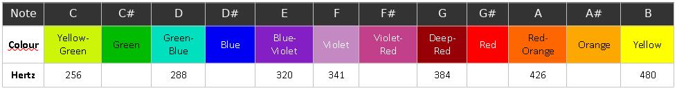
“The octave of visible light, extending from the color red to the color violet, is forty octaves higher than the middle audio octave, that which you would hear on a piano keyboard. Light, however, is measured by its wavelength, whereas sound in measured by its frequency.”
“Waves of light are quite short. For example, the center frequency of the color green has a wavelength that is 0.0000005132 meters long (0.5132 x 10⁻⁶ meters). To make this easy, we measure visible light in a unit called the Ångstrom (Å) (that is a capital Å with a little circle on top). One Ångstrom = 1 x 10⁻¹⁰ meters (that is 0.1 nanometers). The colors of the visible spectrum are measured in thousands of Ångstroms. As show in the following chart, the visible spectrum of light extends from about 7000 Å (red) to about 4000 Å (violet). Also shown in the chart are the center wavelengths for each of the seven basic colors; their corresponding audio frequencies; and the location of the musical notes of an audio octave translated to the the visible spectrum.”
“Thus, when we raise each note in middle audio octave by forty octaves we find its corresponding color harmonic. As shown in the chart below, the note “G” lies in the red area of the color spectrum. The note “A” raised forty octaves lies in the orange part of the spectrum. The note “B” lies in the lemon (yellow-green) part of the spectrum. The note “C” in the green band; the note “D” in the turquoise-blue band; and the note “E” lies in the violet band. Notice that the note “F” lies in the far violet area of the visible spectrum. This is near where the human eye range of color perception begins to drop off (although unique to each person). Also notice that the note F# lies even further from violet, in the near-UV (ultra-violet) area of the spectrum. Thus (when raised 39 octaves rather than forty octaves), it also it resides in the far-red (or near infra-red). Because of this, the note F# embraces the visible spectrum, and thus has some red and some violet, a combination that produces more of a purple color.”
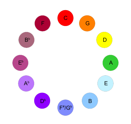
Very similar, but slightly different is the tone-color combination below (another great visualization of the color-tone relationship made by Clay Taylor for his article “Light & Color Theory“. I do suggest you visit his page for more information!).
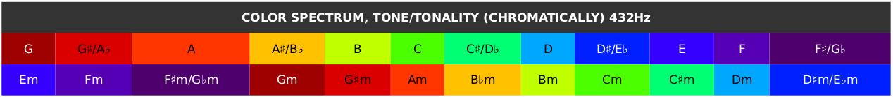
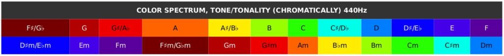
The difference with the color-tone combination of Nick Anthony Fiorenza is approx. a semitone. Cyan for example is represented by the tone “D” at Clay Taylor‘s concept and a “D♭” in Nick Fiorenza‘s concept.
Another interesting color-tone combination is mentioned in “Interference – A Grand Scientific Musical Theory” by Richard Merrick.The difference between his color-tone combination with that of Nick Anthony Fiorenza and Clay Taylor displayed above. Rich Merrick‘s “C” is “kind of blue”, like the “D” of Nick Fiorenza and the D#/Eb of Clay Taylor.Excerpt from “Synesthetic Coupling”
“There have been many attempts through history to establish an association between color and pitch, though none have been universally accepted. Composers like Berlioz, Debussy, Wagner and Scriabin all had ideas about which colors matched which tones. The Rosicrucian Order developed their own color mapping and even Charles Fourier suggested in his 1846 Theorie de l’Unite Universelle an alchemical connection between certain pitches, colors and metals.
One of the more recent proposals suggests that we should reduce light frequencies down to the speed of sound in order to produce a color mapping. While this last theory is a reasonable approach, physicists would argue against this, pointing out that that sound and light waves are not the same kind of energy. Science requires some other causal link or coupling.”
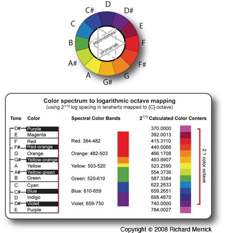
“Rather than use any of the above methods, we will construct our synesthetic model from Isaac Newton’s popular 12-step tertiary color wheel containing three primary colors, three secondary colors and six tertiary colors. Taken as two groups of six colors, the even group of primary and secondary colors can mix adjacently to produce an odd group of tertiary colors in much the same way as one wholetone scale mixes to the other. This suggests coherent light is perceived to mix harmonically just like coherent sound mixes into music harmony. This is without a doubt due to the fact that the visible light spectrum frequency doubles to form an octave of light just like an octave of sound.”
“Since the visible color spectrum ranges from about 375 terahertz on the low end to about 750 terahertz on the high end, the visible color spectrum naturally forms a 2:1 octave doubling of light frequencies like that of a musical octave. From this, we can proportionally map twelve colors to twelve tones by starting just below human visibility at 370 terahertz and then calculating twelve color frequencies by multiplying each preceding color by 2^(1/12), making sure to balance around the center of the visible spectrum. Doing this creates a logarithmic color scale that perfectly matches an equal-tempered musical octave. It also places each color within its corresponding spectral color band for the three cone photoreceptors on the retina of the human eye.”
Another excellent image, displaying the Color, Tone and Chakra relationship was made by Rich Merrick from his work “Interference Theory“, a “must read” if you are interested in this and related subjects!
Richard relates the middle Chakra (Green) to “B” instead of “C” though.
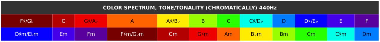
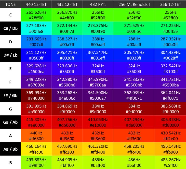
440, 432 (and 256) IN TONE AND COLOR
I have chosen a different color for the Major tonalities and their Minor parallel tonalities. I have chosen to base the color of the tonality on the tonic (unison). The reason I have done so is that the character and function of the tones and chords of the Major and Minor parallel tonalities differ, no matter that they contain the same set of tones. The Major tonalities/colors represent the appearance to the “outside world” (extraversion) and the Minor tonalities/colors represent the “inner world” (introversion).
The first thing you might have noticed, is that the difference in Concert Pitch results in a different colors. Not only does a difference in Concert Pitch change the color, what Temperament is used does play a role as well. Below a table with several Concert Pitches and Temperaments more often mentioned at Roel’s World.
NOTE: All colors were calculated at 16 degrees temperature and 45% relative humidity. When the temperature and humidity (as well as air pressure – PSI) changes, the pitch – and thus color – will change slightly as well. The same “tone” played on an instrument at sea level or on a mountain top can actually be “different” tones with www.flutopedia.com
Keep in mind that the differences optically (in color) are far less obvious then the aural differences (in sound). This has to do with the difference of the number of “dimensions” (3 optical “dimensions” vs. at least 3000 aural “dimensions” as mentioned earlier in this article). The aural differences are pretty obvious for most listeners.
WHY SOME RELATED RED TO “C”
If you have browsed the internet, you might have come across various articles and images that set C as Red. There are a couple of reasons why they might have done so:
The first Diatonic (Greek) Modein modern times called “Ionian” is that of C. Ionian (fist mode) / C = Red (first color of the spectrum). According to various sources though the Aeolian and Ionian were introduced by Heinrich Glarean in 1547. Originally the first mode is said to have been the Dorian mode (tonic on D) for it’s mathematical symmetry and not the Ionian scale. In that case Dorian mode / D = Red instead.
C is generally on top (first) in the Circle of Fifths and Chromatic Circle, red is the first of the visible colors thus C = Red.
Some composers might have placed C at red due to the relationship between the Zodiac sign Aries and the tone C (see Roel’s World article about Tone Zodiacs and Roel’s interpertation / implementation article). The tone C is generally seen as the starting point of a tone circle, as Aries is the first sign in the Zodiac Circle. Aries is “ruled” by the planet Mars and the color related to Mars is red. Thus: Red = Mars / Aries = C.
Even though some of the these reasons mentioned for using Red with C do make sense up to a certain degree, the actual frequency light-to-sound relationship tells us that in reality (nature) C is Green, not Red, as evident from work of Nick Anthony Fiorenza.
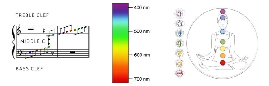
WHY DO I SUGGEST C TO BE GREEN?
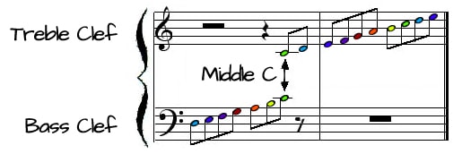
From a music theoretic point of view we do find “Middle C” in the middle between the treble and bass cleft. Thus, relating the note / tone in the middle to the color in the middle of the color spectrum (green) makes sense.
You could also look at it from a “spiritual” point of view.In Sanskrit, Anahata (the 4th and “Middle” Chakra) is associated with balance, calmness, and serenity. Anahata means “pure” or “clean, stainless”, “unhurt, unstruck, and unbeaten”.
That seems to me like a good match with the tonality of C: no “accidentals“ (sharps or flats).The color traditionally used for the 4th Chakra is Green.
This is how the Chakra Tones sound if the color-tone conversion of Nick Anthony Fiorenza is used:
MY PREFERED COMBINATION: middle C, with the middle Color (green) and middle Chakra.
VARIOUS OTHER COLOUR-TONE COMBINATIONS
WALTER BOWMAN RUSSELL
Walter Russell, an American painter of the Boston School and a sculptor, an illuminate, a natural philosopher, a musician, an author and a builder connects tone and color in his book “The Universal One” (1929) on page 249 as follows:
It might be worth your time to read the works of Walter Russels, he provides a very interesting view point on many different subjects concerning natural philosophy and more. His color-tone combination is though very different from those mentioned earlier in the article!
Most common is the combination low pitch (tone frequency) with high wavelength (light) and visa versa. That would result from left to right (low pitch to high pitch) on the piano with Red via Orange, Yellow and Green to Blue and Violet.
What you might have noticed, is that unlike most of the tone-color combinations Walter Russell has “reversed” the following order of the spectrum in comparison to the tone pitches. That to me does not look very “scientific”, if one ignores the fact that wavelength and frequency are not the same and can not be converted one-on-one.Another interesting difference is that Russell added infrared to the spectrum, infrared is not visible to the human eye and thus a “color” we can’t see. If we on one hand only use tones / sound we can hear in a “concept”, then why would we relate / combine one of these tones we experience with one of your senses (ears) with a color / light we can not see with the “naked eye” (another one of our senses)? This does not make sense to me.
That Walter Russell has some “odd” views on the relationship between tone and color also becomes clear when we look at the following drawing:
What we see in this image is the color spectrum and its relationship to elements as well as tones. But, not all tones of the scale, only a part: Do, Re, Mi, Fa and Sol. Thus no La and Ti/Si.
What makes it a rather “odd” drawing, is that only 2 of the 5 tones mentioned are represented by one color each (Do / C by White and Sol / G by Yellow), but the other 3 tones are represented by 2 different colors each: Re (D) is represented by both Magenta (or as Russell called it in the previous image “Infra Red”) and Violet, Mi (E) is represented by Red and Blue and Fa (F) is represented by both Orange and Green.
The lack of “consistency” (in this case some tones are represented by one color, others by two) by itself makes a theory questionable.
More important: if the full visible color/light spectrum represents only Do – Sol, then what colors/light are/is “La” (A) and Ti (B) represented by? And why is C represented by White? White is generally “seen” as either all colors together (light) or the absence of color (paint).
This drawing of Walter Russell’s work just does not make sense, it is incomplete and inconsistent, probably one of the worst tone-color combinations suggested in history. If one thing, then it proofs that great minds might not be right about everything that they share with the world. 😉
ALEXANDER NIKOLAYEVICH SCRIABIN
Alexander Nikolayevich Scriabin was a Russian composer and pianist. Though Scriabin’s late works are often considered to be influenced by synesthesia, a condition wherein one experiences sensation in one sense in response to stimulus in another. His colour system, unlike most synesthetic experience, accords with the circle of fifths: it was a thought-out system based on Sir Isaac Newton‘s Opticks.
Note that Scriabin did not, for his theory, recognize a difference between a major and a minor tonality of the same name.
In his autobiographical recollections, Sergei Rachmaninoff recorded a conversation he had had with Scriabin and Nikolai Rimsky-Korsakov about Scriabin’s association of colour and music. Rachmaninoff was surprised to find that Rimsky-Korsakov agreed with Scriabin on associations of musical keys with colors; himself skeptical, Rachmaninoff made the obvious objection that the two composers did not always agree on the colours involved. Both maintained that the key of D major was golden-brown; but Scriabin linked E-flat major with red-purple, while Rimsky-Korsakov favored blue.
An interview for BBC and a TEDTALKS presentation by Neil Harbisson, born with achromatism (he does not see color), about how the implementation of technology can make him experience color through sound. He colors the C Major scale (starting in his interview with Red = F) as follows:
F
G
A
B
C
D
E
CONCLUSION
I personally find the tone-colour relationship as described by Nick Anthony Fiorenza, Clay Taylor or Richard Merrick as most likely to be accurate, there is mathematical and scientific reasoning that validates it. This is how nature seems to work and thus the most natural implementation.
For tone-color combinations in various articles on Roel’s World I have used the tone-colour relationship as provided by Nick Anthony Fiorenza.
This does not mean that if you have come to a different tone-colour combination that you are ‘wrong’!
In fact, the “highlighted” concepts by Clay Taylor and Richard Merrick for example are equally well created.
As unique beings the ‘data’ our brain receives from our senses and the interpretation by the brain of this “data” can vary from person to person. The shape of ones ears, in particular the “cochlea” (inner ear), effects the way sound is perceived, the same tone can sound ‘different’ (in timbre) from person to person … also in the perception of light / colour there can be differences, there are even ‘conditions’ mentioned in the literature on this subject where the relationship of wavelength/frequency and colour differ, for example the hypothetical case with the ‘inverted spectrum’ (someone with an inverted spectrum might experience green while seeing ‘red’ (700 nm) light, and experience red while seeing ‘green’ (530 nm) light), or for example a condition called Synesthesia. Synesthesia provides some atypical but illuminating examples of subjective colour experience triggered by input that is not even light, such as sounds or shapes.
IN OTHER WORDS: The possibility of a clean dissociation between colour experience from properties of the world reveals that colour is a subjective psychological phenomenon.
.jpg)

")
")


")

")
